 DONNOK
DONNOK’s 8 display themes compared: style, readability and orientation
Compare all eight DONNOK themes by style, number readability and landscape or portrait layout, using actual app captures. Themes never change your funds or calculations.
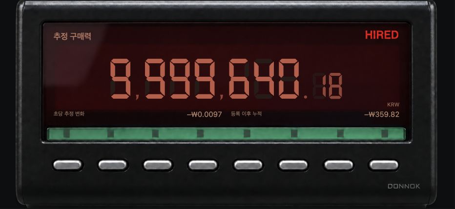
How do the eight themes compare at a glance?
The table below summarizes 16 actual full-screen captures from the app. The readability column describes the shape and placement of the numbers on screen; it does not mean any theme is more accurate.
| Theme | Style | Number readability | Landscape and portrait |
|---|---|---|---|
| MINIMAL | Light beige background with generous space | Large, thin numerals; the ₩ sign and decimals are the same size | Large centered number in both; portrait stacks details below |
| MONO | White numbers on black | Bold monospaced digits with strong contrast | Large centered number in both; details sit small in the lower corners |
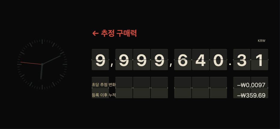
| FLIP | Turning number cards | Each digit has its own card, so digit groups are easy to tell apart | Cards fill the landscape screen; portrait uses smaller cards with numbered detail rows |
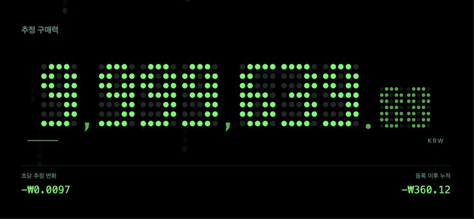
| LED | Green dot digits on a dark background | Digits drawn with dots; decimal places appear smaller | Dot digits in both, with faint columns of numbers in the background |
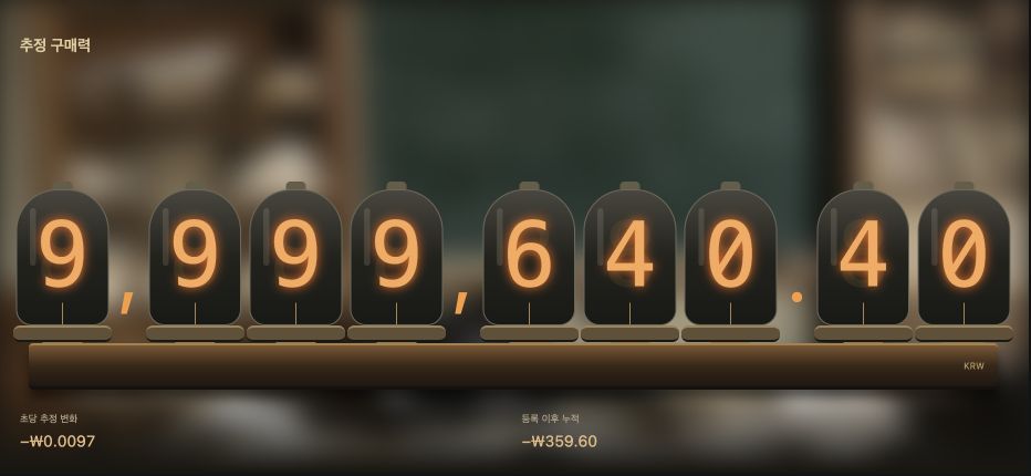
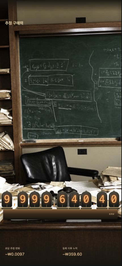
| NIXIE | Orange glass tubes in a study | One digit per tube; in landscape the numbers stand out against a blurred background | Tubes span the landscape screen; in portrait they sit on a desk below a study with a chalkboard |
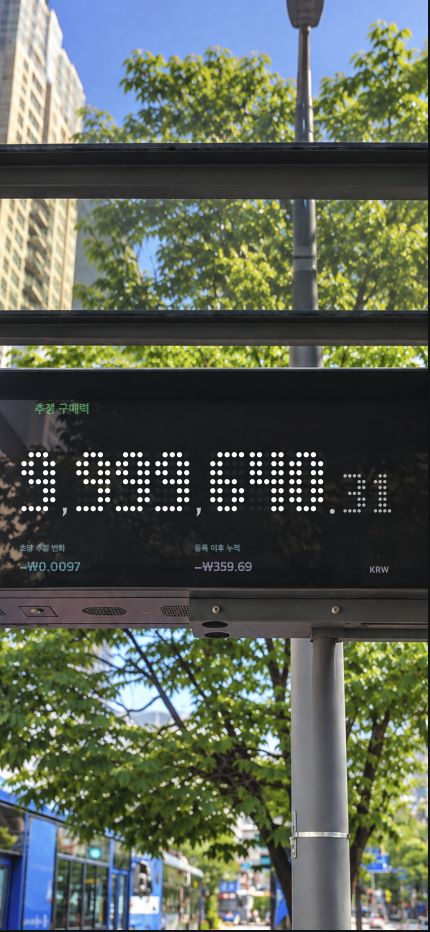
| SEOUL | Subway departure board and bus-stop display | Landscape: split digit cells beside an analog clock; portrait: white dot digits | The scene changes with orientation: a departure board in landscape, a bus-stop photo in portrait |
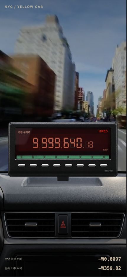
| NYC | New York taxi meter | Red seven-segment digits; decimal places appear smaller | Landscape is a meter close-up; portrait shows the street through the windshield with the meter on the dashboard |
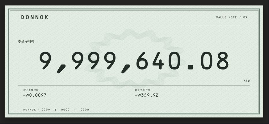
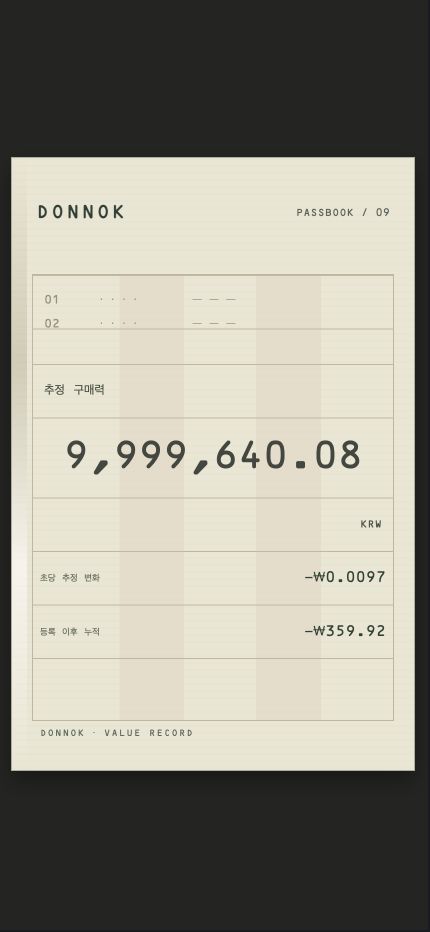
| BANK | Printed numbers on a check and passbook | Dark numerals on light paper | A check layout in landscape, a passbook page in portrait |
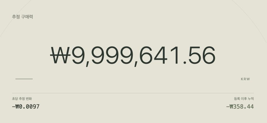
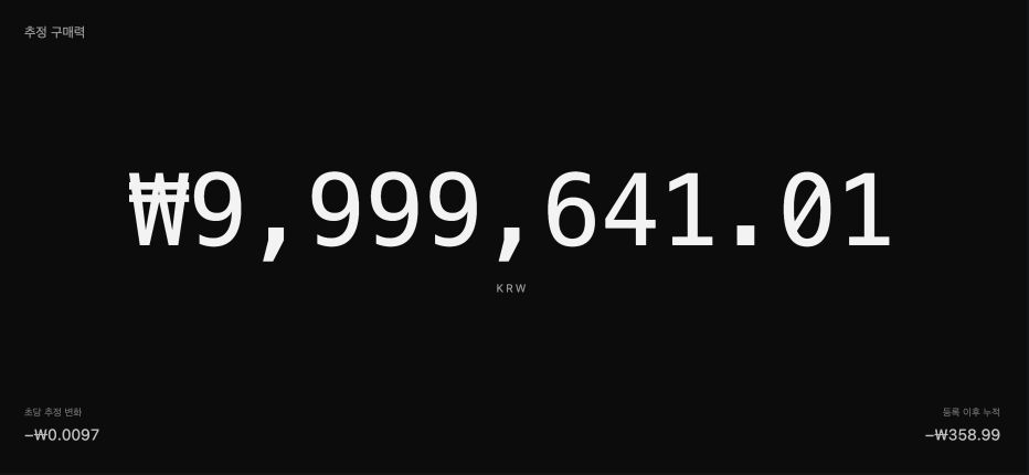
MINIMAL or MONO: which keeps the focus on numbers?
MINIMAL and MONO keep decoration to a minimum and show the amount at its largest. Start with MINIMAL if you prefer a light screen, or MONO for crisp contrast on a dark background.
Both themes show the estimated change per second and the cumulative change since registration in small type below the amount. These values come from the same calculation in every theme.
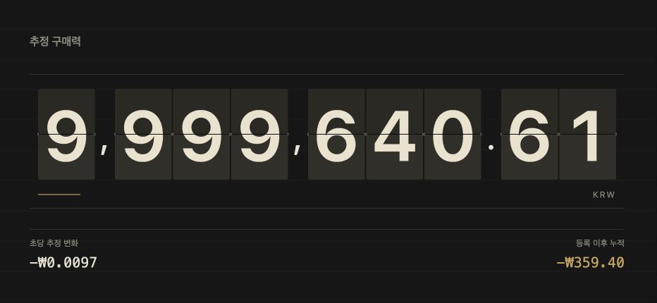
How do FLIP, LED and NIXIE differ in texture?
FLIP shows a card for each digit, LED draws digits with green dots, and NIXIE shows numbers in orange glass tubes. LED and NIXIE also have background numbers or a photo, which gives them a stronger atmosphere.
Flipping or glowing digits are visual effects. They do not mean money is moving or that new economic data has arrived.
What scenes do SEOUL, NYC and BANK show?
SEOUL draws on subway boards and bus stops, NYC on a New York taxi meter, and BANK on the printed numbers of checks and passbooks. These themes place your estimate inside a familiar scene.
Because the scenes carry more detail, the supporting information around the amount is smaller. If quick reading matters most, compare them with MINIMAL and MONO.
How different are landscape and portrait?
MINIMAL, MONO, FLIP and LED rearrange the same elements when you rotate the screen. NIXIE, SEOUL, NYC and BANK change their background scene or layout in portrait, so it helps to view both orientations before choosing.
You can switch between all 16 landscape and portrait captures in the homepage theme gallery. All amounts in the captures are sample funds.
Does changing the theme change the calculation or accuracy?
No. Every theme uses the same funds and the same calculation basis. The amounts in the captures above differ slightly because they were taken at different times and the estimate changed in between, not because of the theme.
You can choose a separate widget theme in Settings → Widgets. Widgets have limited space and do not reproduce full-screen backgrounds, and iPhone Lock Screen widgets use the system’s monochrome style.